introduction
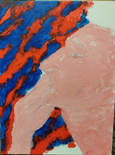
Coming from a background without much awareness to aesthetics but having been an art student for many years, to me the complexity of the painting/drawing procedure has always been more important than the very refined brush stroke or perfectly painted light and shadow. The stacking of layers of paint creates depth to the image (fig.1). By keeping all the procedure layers visible, it informs the audience of the highly curated process. The following is an example painting made by me, when zoomed in all the details are really sketchy (fig.2), but by using the layering technique the final result turns out to be quite successful.
This painting technique inspired me of a certain architecture understanding, which will be explained in the following.


Since I started doing architecture my design considerations have always been really objective rather than personal preferences. The lack of confidence in making a bold, or even ignorant, statement is both a weakness and a strength.
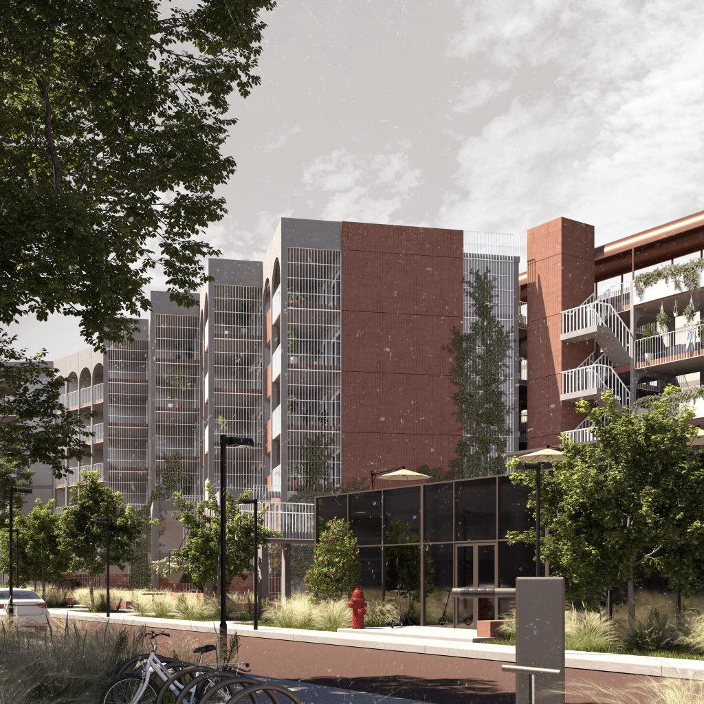
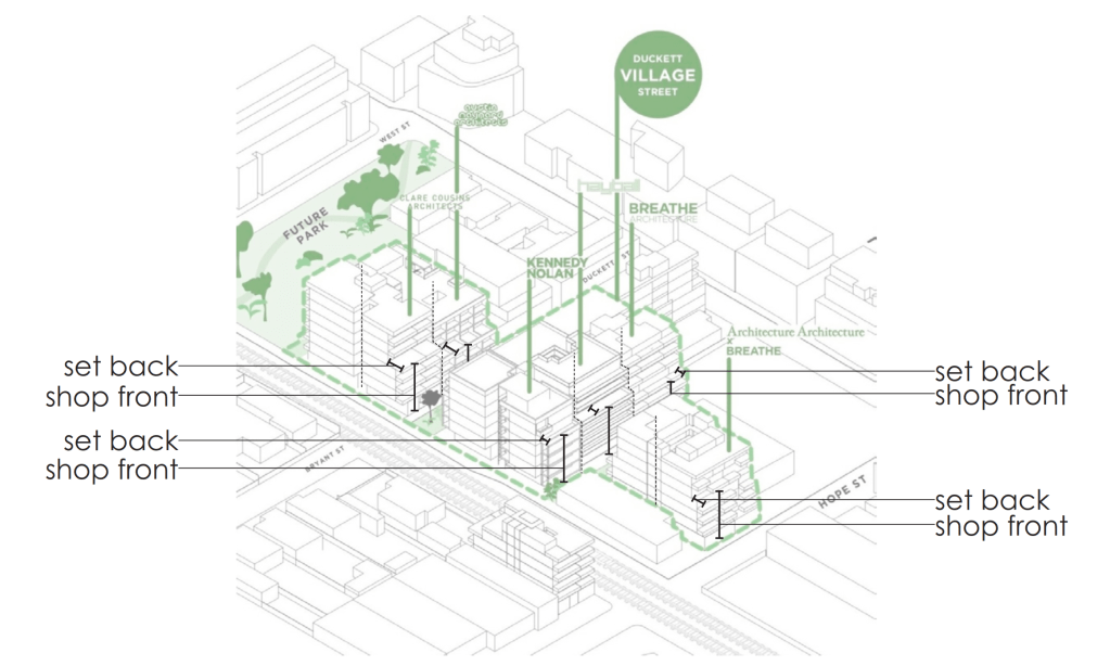
In the contemporary context, architecture is very subjective to the context. A lot of the times the form of the building is already designed before the architects have even started thinking. The standard set back, the first few levels being shop front, the straight vertical party wall (fig.3). Most of these decisions are regulations related.
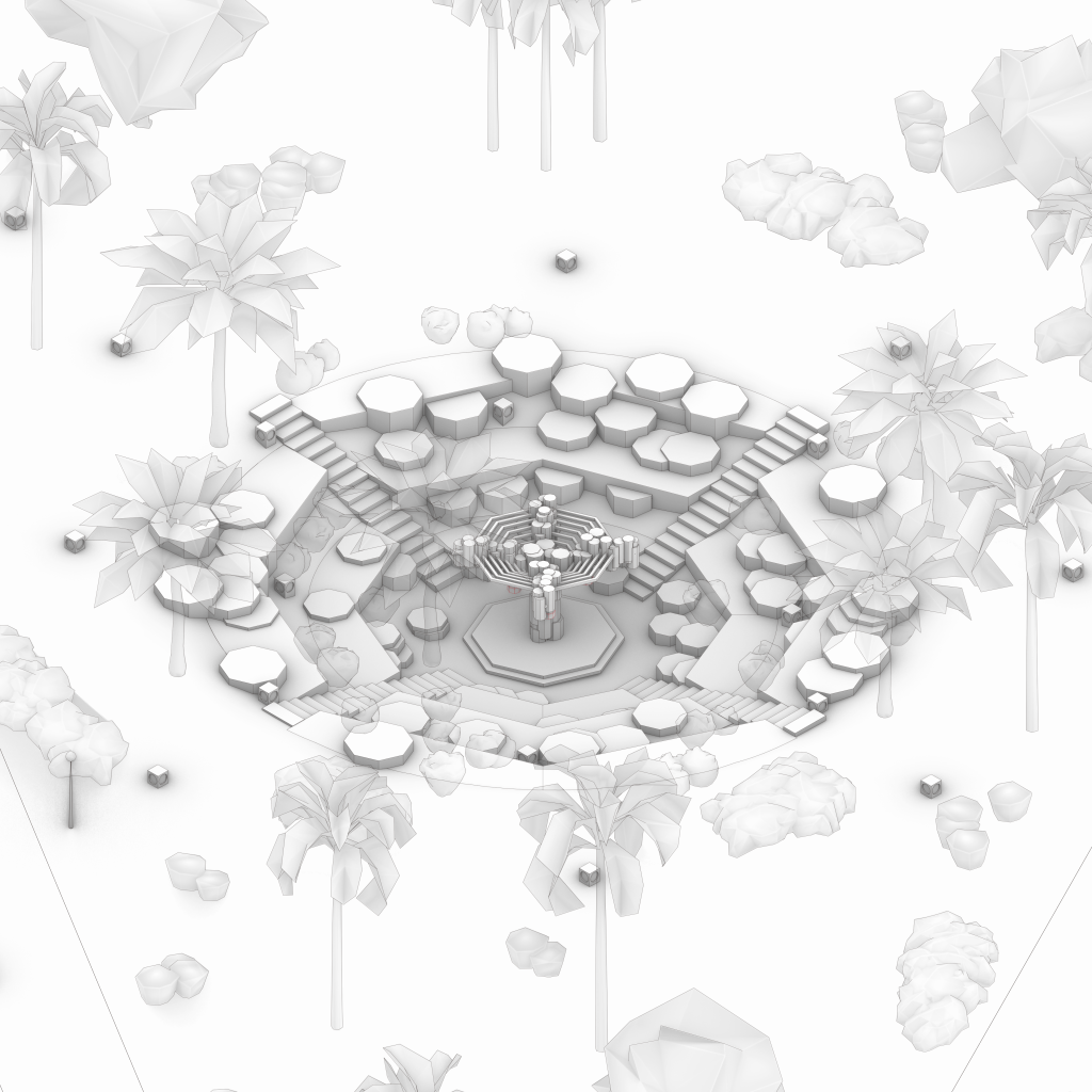
This to me is not necessarily a disadvantage, if form of the architecture is decided by the context, that means it is already in its optimal iteration. Therefore, what needs guidance is, rather than the philosophical conceptual thinking, the practical design process. What makes a good architecture is the design of the physical barrier, the visible and invisible layers wrapping around the architecture volume (fig.4).
what’s wrong?
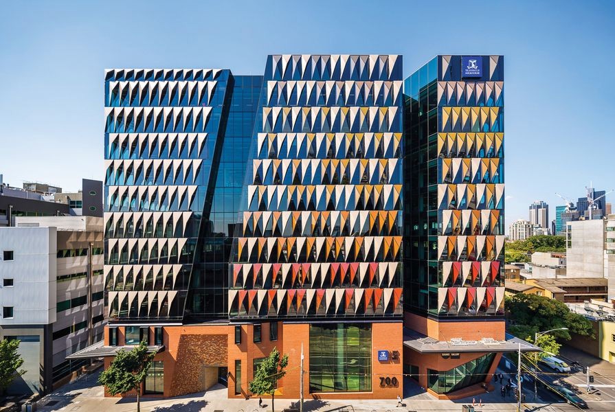
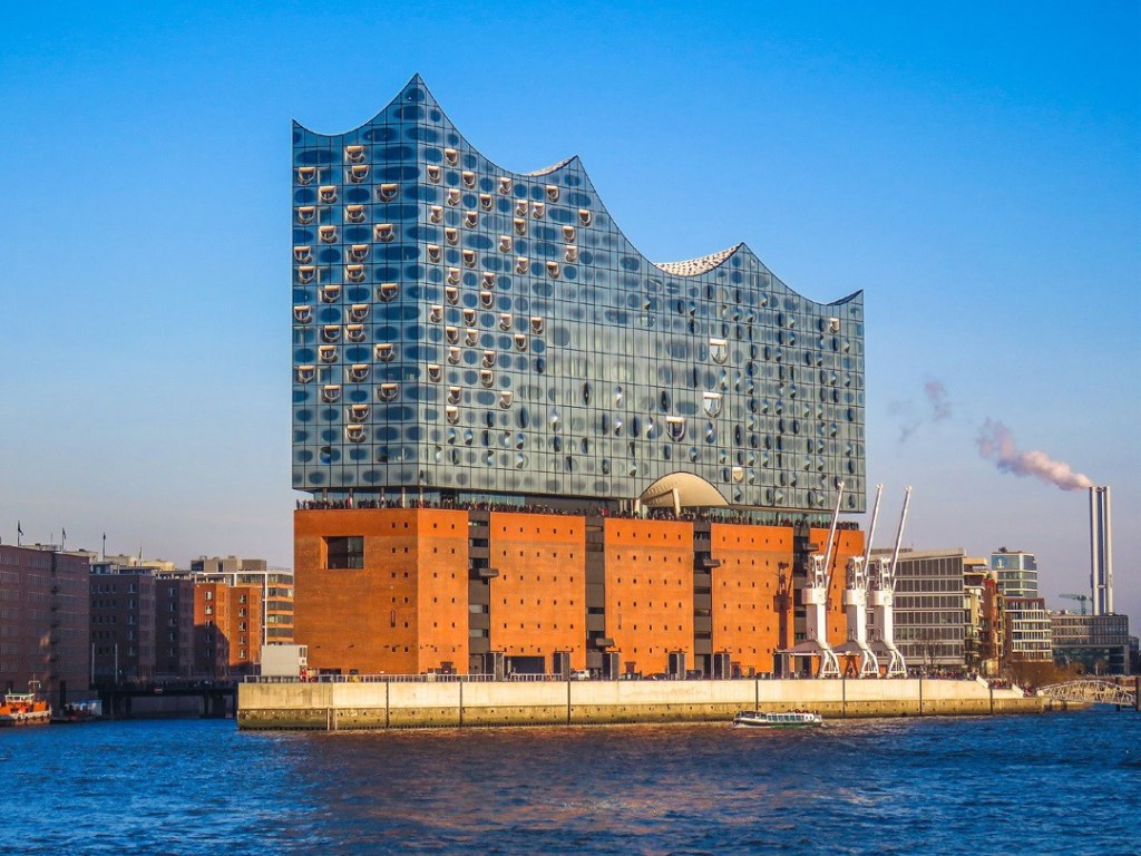
A problem with modern architecture is the lack of depth. With the more and more sustainability focused design, the attention to aesthetics and the user experience controlled by architectural language has been neglected. There are too many examples all around the world, based on my observations a good example is the Melbourne Connect by Woods Bagot (fig.5). It is a very good building in terms of sustainability design and user experience, but the “architecture” is disappointing. First, its lack of depth, the façade is a huge glass panel with lots of repeated colourful triangular shading panels; the building looks somewhat like the Elbphilharmonie by Herzog & de Meuron (fig.6), but with much less visible layers. Second, architectural design became secondary to engineering in creating this environment.
An example that explains the cause of flatness is the early Manhattan skyscrapers. Talked about by Rem Koolhaas in Delirious New York, at that time, the skyscrapers’ exterior and interior are isolated. Mathematically, the volume figure of the interior space increases much quicker than the area figure of the exterior façade proportionally. This became the reason for the architectural lobotomy (1), the interior and exterior become two separate architectures. Exterior for the sculptural appearance for the city, interior for the highly controlled and decorated indoor environment with advanced technologies.
(1) Architectural lobotomy: lobotomy is a surgical severance, meaning the disconnection between frontal lobes and the brain, in order to relieve mental disorders. Architectural lobotomy means separating the exterior and interior.
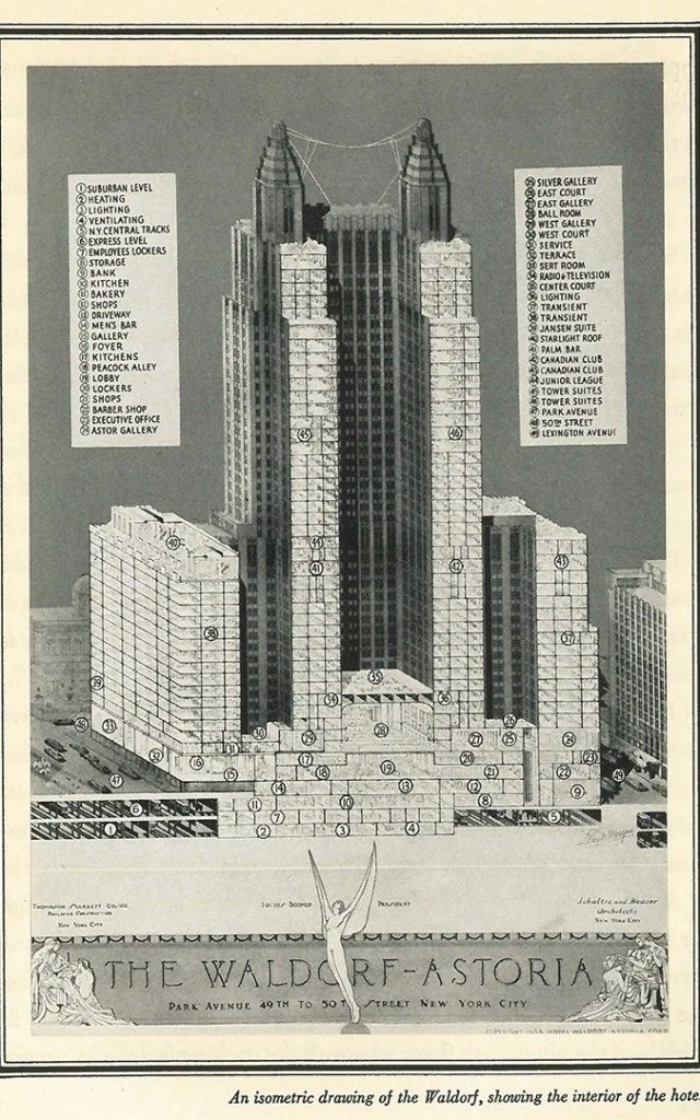
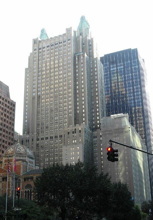
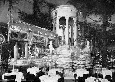
Essentially, all the functions, human activities, well designed interiors are hidden by the external “shell”. The Waldorf-Astoria New York by Schultze & Weaver is an example, the section drawing (fig.7) shows all sorts of interesting activities throughout the entire building, but everything is hidden behind the solid façade (fig.8), as if there is only office space behind. It is understandable that when the building was constructed, the technology was not advanced enough to create large thresholds.
New York
Looking at other examples in Melbourne, Library at the Dock by Clare Design (fig.9), is a green building following modern standards. The sustainability aspect of the building is fantastic, but again the flatness is too obvious. Except for the huge overhang, there is barely any layering around the building. The building has the opposite quality as the Waldorf-Astoria New York, the transparency is showing everything that is happening in the interior (fig.10). Occupants on both sides can feel a sense of insecurity, as the visual interaction is too direct.

solutions
The requirement for good architecture is not only for it to satisfy all the required functions. Architecture is the art and science of designing buildings/structures, the two things are very much connected. The scientific aspect of architecture includes a wide range of things, structure, indoor environment control, sustainability, façade performance, transportation/circulation, etc. essentially all the required functions of a building. The art of architecture is primarily based on visual beauty, which needs to be created by the “science” of architecture. As for why visual beauty is important, an example is architecture renovation projects; most of the renovated buildings are beautifully designed architectures, that are worth keeping. Like Tate Modern designed by Herzog & de Meuron, one of the concepts is to exhibit the old brick building (fig.11).
As mentioned in what’s wrong, the lack of depth in modern sustainability focused buildings, the problem with disconnected interior and exterior, and overly transparent building caused by flat- ness. The following are the solutions.

1. The activities happening in the interior space should be shown To The public, with different spaces occupied by different activities (indoor & outdoor) placed next to each other, while connected with visual thresholds.
A building is made with lots of functional spaces. For example, a house is made up of living space, sleeping space, walking space, dining space etc. A typical library is made up of library space, working space, horizontal and vertical circulation space, café space etc. Spaces with different functional purposes are designed differently, such as the lighting, the arrangement of furniture, whether it has greeneries etc. These are the fundamentals that make a building experiential when the users are inside. These fundamental spaces are naturally stacked next to or on top of each other.
The most important process is to actually make the stacked layers of spaces visible, and especially to the exterior. This process creates depth in a building which scopes into the internal spaces of a building, therefore creates interaction between spaces, be- tween inside and outside. In Delirious New York, Koolhaas argued that the exterior and interior should be two separate architectures.
“One is the architecture of metropolitan exteriors whose responsibility is to the city as sculptural experience. The other is a mutant branch of interior design that, using the most modern technologies, recycles, converts and fabricated memories and supportive iconographies that register and manipulate shifts in metropolitan culture.”
(Koolhaas, 1994, pp. 104)
Koolhaas used Henry Erkins’ work as an example, Erkin created an artificial Roman garden in the interior of an existing building (fig.12), with technologies such as artificial lighting and projecting screens. While Koolhaas communicated his idea with this ex- ample, however, the example itself is a very rare exception. The majority of buildings do not have the scenario of recreating an ancient garden inside. The ideal way is to make the building interactive by hinting at what is happening in the interior. Same idea is shown in some of Herzog & de Meuron’s works.
“The idea is to encourage the visitor to move mentally through the building -even before he or she has crossed its threshold- just as one might move through a picturesque landscape.”
(Herzog & De Meuron: 2005/2010, 2010, pp. 17)
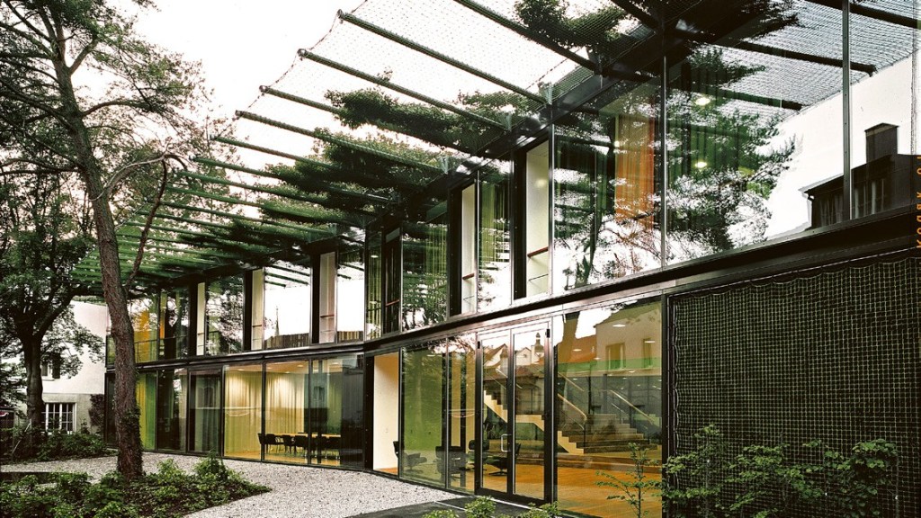
In the VitraHaus by Herzog & de Meuron (fig.13), the interior space is completely visible to the public. In this case, the architect divided the project into different spaces, it takes idea of “stacking functional spaces next to or on top of each other” quite literally.

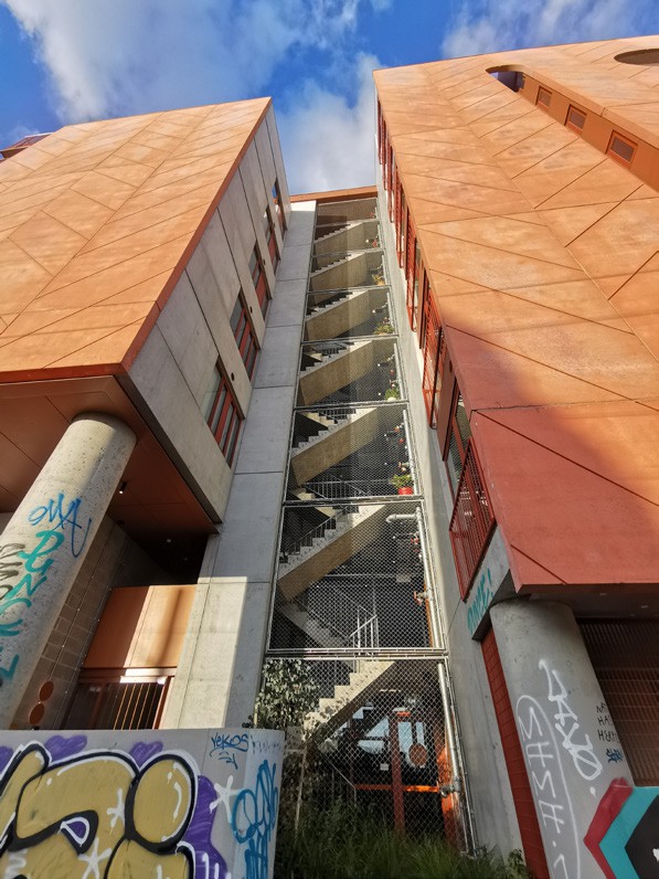
2. The visual thresholds between spaces need to be controlled to make the transition from space to space “gentler”. By stacking layers of elements, such as space, structural elements, skin façade etc.
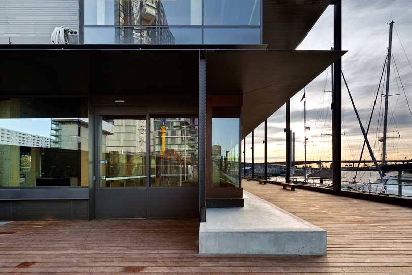
This method focuses on the envelope where the building transitions from exterior to interior. In modern context, most of the time a building site has a fixed perimeter. Outside that perimeter is of- ten sidewalk or road or landscape, where people can circulate. While most buildings have setbacks from the perimeter, it does not really transition the external realm to internal space “gently”. With the help of open outdoor space, circulation space, and a range of “accessories” such as handrails, vegetations, soft mesh, overhangs etc. the transition is softened (fig.14). The concept of stacking layers is not necessarily the more layers the better, but to hide the interior space to a certain degree while still being visible to the public eye.
The purpose of having the “gentler” transition is to avoid the feeling of insecurity as if one is catching all the attention of the occupants inside the building. For example, when one walked past a fully transparent glazed façade, with lots of people sitting inside eating or working, one might feel the uncomfortable “stare” from inside the building.
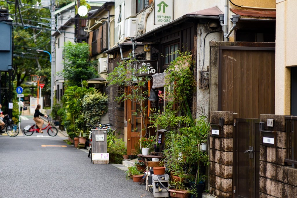
“Though vast in size, much of its metropolitan area is made up of low- scale buildings bound together by narrow, winding streets.”
(Pollock, 2016, pp. 12)
Described by Naomi Pollock, Fujimoto’s observation of Tokyo. The idea of one massive metropolitan is broken into smaller scaled elements makes Tokyo a very pedestrian friendly city (fig.15), this shows a similar approach to the method of breaking a façade into different layers.
In House NA by Fujimoto (fig.16), the softened transition from exterior to interior is great. This example is a bit extreme, but it shows the idea better. While being an almost fully transparent house, the use of overhangs, balconies, structural columns and vegetations effectively reduced the abrupt feeling the glass creates.
Talking about glass, Herzog & de Meuron has a different approach of using glass to soften transition from outside to inside. With different kinds of glass, clear, semi-transparent, coloured etc. the transition from inside to outside can be controlled. However, by only using glazing the flatness becomes problematic, as previously justified. In 154 Ricola Marketing Building by Herzog & de Meuron chose to use curtains to add more layers into the transition zone (fig.17).

3. Use structural/non-structural elements as an exposed multifunctional layer around the building perimeter. The layer should be an aesthetic expression, a structural element, and in the form that responds to the previous two solutions (creating visual thresholds).
The structural/non-structural elements are the tectonics of architecture. Architectural tectonics are not only for structural purposes, but to showcase the art of architecture with the components of the science of architecture, by creating complexity with advanced building engineering and/or traditional crafting skill. A beautiful piece of architecture should be complex to human eyes, especially to non-architects, should impose an unachievable feeling. The complexity is created by layering of structures and materials, each layer of structure or material should be thought- fully designed almost as an “individual piece of art”.
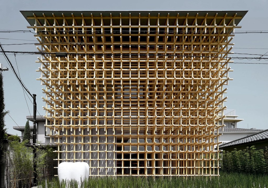
This quality is shown in Kengo Kuma’s works. His approach of combining advanced building method and traditional crafting skill creates the layered complexity on the façade. In GC Prostho Museum, the wooden joint system is used as a layer wrapped around the façade (fig.18). It is showing the tectonics of traditional wood construction joint. The layer also insists of lots of visual threshold, that one can see the concrete structure and interior space be- hind glazed curtain wall. The “individual piece of art” is shown in every single layer of the façade, starting from the grass and bam- boo around the building, then the wooden joint system, the mixture between clear glass and concrete, finally the visible interior space behind the glazing.
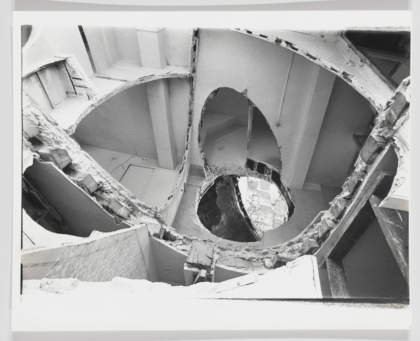
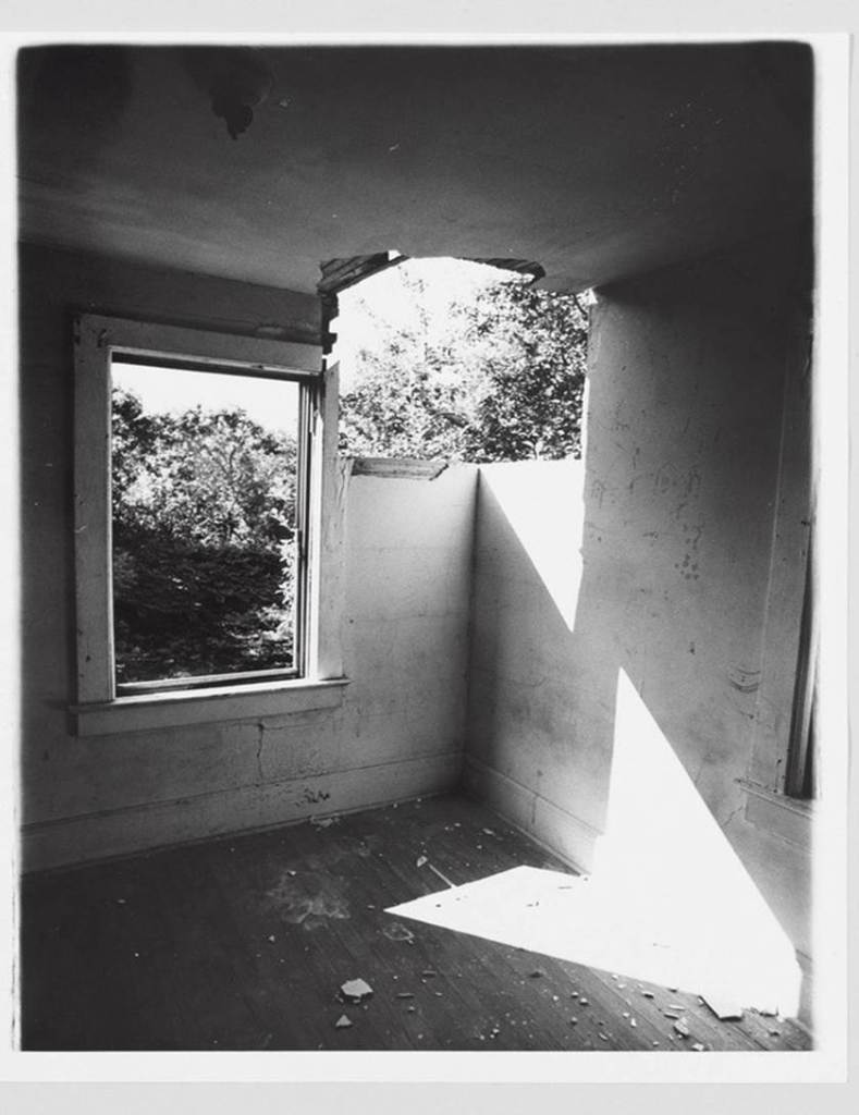
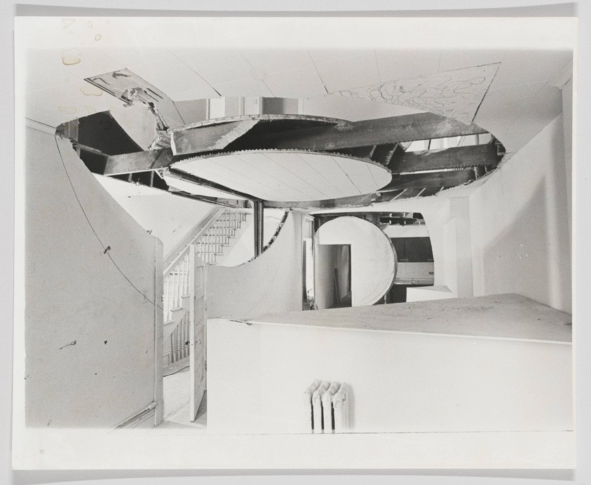
Gordon Matta-Clark is an artist, who uncovers hidden layers in buildings. (fig.19, 20, 21)
“I was most interested in the narrow transition from is covered up to what is made visible, perhaps more so than the view that it created. The layers, the overlaps, all the different things that are accounted for. Uncovering how such a uniform surface comes about.”
(Gordon Matta-Clark, 1974)
Matta-Clark’s works inspired Herzog & de Meuron about the sub- tractive sculptural procedure in architecture design. However, his art works expressed a different idea which is breaking the enclosure of a typical building by creating an opening. It breaks the barrier between public and private space, also uncovers the concrete reinforcement, insulations, sandwich wall, which are elements hidden from us but right next to us in our everyday life.
Art works by Gordon Matta-Clark:
4. layered façade is beneficial for passive design.
In modern context, sustainability becomes a main driving force for architecture design. The use of double-skin façade is becoming more and more popular, this trend is actually helpful to the idea of stacking layers, as the skin façade is a layer (fig.22, 23). With design procedure following the previous solutions, the aesthetic expression and space interaction can be made.


finally
This manifestation is from my own experience and observation of many famous international and local (Australia) architects’ works. The similar idea has been applied to my paintings and drawings, much earlier than I realized it can be used architecturally. Seems like this idea has always been at the back of my mind. I have been trying to apply this “layer stacking” method in my studio works, and it is making my design more thoughtful. As I mentioned in the introduction “architectures are very subjective to the context”, the concept and form of the architecture needs to react to the site, then this manifesto can come in handy during the design stage.
How should one design after reading this? Here is a summary.
• Aim to have layers wrapping around the architecture.
• Find the balance between art and science in architecture.
• Human activities inside the building can be utilized as aesthetic features.
• Find the balance of how much visual threshold is enough, should not have no privacy, or completely closed off.
• The scientific aspect of architecture should be part of the aesthetic, the mechanical, structural engineered elements have their beauty.
• Create visual thresholds with elements that serves other functions, visual threshold is not necessarily window or glass wall, it could just be a gap between two columns.
• Layered façade is beneficial for passive design.
references
• Koolhaas, R. (1994). Delirious New York : a retroactive manifesto for Manhattan. Monacelli Press.
• Frampton, K. (2012). Kengo Kuma : complete works. Thames & Hudson.
• Pollock, N. R. (2016). Sou Fujimoto. Phaidon Press.
• Mack, G. (2005). Herzog & de Meuron : das Gesamtwerk Band 3. Birkhäuser.
• Herzog & de Meuron. (2010). Herzog & De Meuron : 2005/2010. El Croquis Editorial.
• Matta-Clark, G. (1974). Gordon Matta-Clark: Splitting (The Humphrey Street Building). Avalanche.
images
fig.3 Nightingale Studios. (n.d.). The Village-Nightingale. In Nightingalehousing. https://www.nightingalehousing.org/precinct/the-village
fig.5 Casamento, P. (2022). Melbourne Connect. In ArchitectureAU. https://architectureau.com/articles/melbourne-connect/
fig.6 Hackercatxxy. (2016). Elbphilharmonie Hamburg. In Wikimedia Commons.
fig.7 An isometric drawing of the Waldorf, showing the interior of the hotel. (1931). In The Telegraph. https://www.telegraph.co.uk/money/property/sec- ond-homes/inside-1-billion-restoration-new-yorks-waldorf-astoria-hotel/
fig.8 Reading Tom. (2012). St Bartholomews and The Waldorf Astoria Hotel. In Wikimedia Commons. https://commons.wikimedia.org/wiki/File:St_Bartholomews_and_The_Waldorf_Astoria_Hotel.jpg
fig.9 Snape, D. (2015). Library at the Dock. In ArchitectureAU. https://architectureau.com/articles/library-at-the-dock/#
fig.10 N/A. (n.d.). In Clare Design. https://claredesign.com.au/portfolio/public/docklands-library/
fig.11 Acabashi. (2018). Tate Modern - Bankside Power Station. In Wikimedia. https://commons.wikimedia.org/wiki/File:Tate_Modern_-_Bankside_Power_ Station.jpg
fig.12 Jazz Age Club. (2010). The Roman temple and barge feature in Murray’s Roman Gardens. In Jazz Age Club. https://www.jazzageclub.com/the-magnif- icent-murrays-roman-gardens/453/
fig.13 El Croquis. (2010). VitraHaus. In Herzog & De Meuron : 2005/2010.
fig.15 BETTS, N. (2017). Kagurazaka street scene. In Savvy Tokyo. https://savvytokyo.com/kagurazaka-tokyos-finest-blend-tradition-modernity/
fig.16 Baan, I. (2012). House NA. In Dezeen. https://www.dezeen. com/2012/05/08/house-na-by-sou-fujimoto-architects/
fig.17 Spiluttini , M. (n.d.). Oficinas comerciales de Ricola, Laufen. In Arquitec- tura Viva. https://arquitecturaviva.com/works/oficinas-comerciales-de-rico- la-laufen-10
fig.18 Ano, D. (n.d.). Museo y centro de investigación Prostho. In Arquitectu- ra Viva. https://arquitecturaviva.com/works/museo-y-centro-de-investiga- cion-prostho-3
fig.19 Estate of Gordon Matta-Clark / Artists Rights Society (ARS), New York. (1977). Conical Intersect 1 (Documentation of the action “Conical Intersect” made in 1975 in Paris, France). In Whitney Museum of American Art. https:// whitney.org/collection/works/43339
fig.20 Estate of Gordon Matta-Clark / Artists Rights Society (ARS), New York. (1977b). Splitting (Documentation of the action “Splitting” made in 1974 in New Jersey, United States). In Whitney Museum of American Art. https://whitney. org/collection/works/43350
fig.21 Estate of Gordon Matta-Clark / Artists Rights Society (ARS), New York. (1978). Circus 1 (Documentation of the action “Circus-Caribbean Orange” made in 1978 in Chicago, United States). In Whitney Museum of American Art. https://whitney.org/collection/works/43364
fig.22 HJORTSHØJ, R. (2017). PARK’N’PLAY facade. In Divisare. https://divisare.com/projects/335207-jaja-architects-rama-studio-rasmus-hjortshoj-coast-park-n-play
fig.23 GONZALEZ, B. (2023). TEXOVERSUM facade. In Divisare. https://divisare.com/projects/488907-allmannwappner-menges-scheffler-architekten-brigi- dagonzalez-stuttgart-texoversum
Huge thanks to my tutor William Ward!